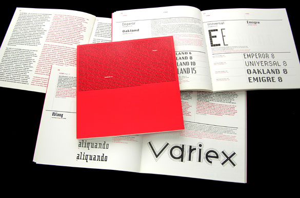
The Emigre Exhibition catalog caught my eye wit hits interesting use of typography. A lot of the work seen on the sight is very minimal. A few words in the center of a cover. Pretty words. Pretty and clean. In the catalog they took a slightly diffferent approach. They put a paragraph's worth of information on the cover, but added attention to the title of the piece by simply changing the color of those three of four words. The white on red really stands out. There is no confusion as to what the catalog is. It gives you the nessecary information, and looks good while doing it. What more do you want?
No comments:
Post a Comment