Wednesday, February 27, 2008

What I learned in class 2/24/08

Let's see now.

I learned that it's always important to read/follow directions.
I was reaffirmed in the fact that knowing how to talk about your work is just as important, if not more so, as the work itself.
Kim is crazy.
Don't use a font that wasn't created with any punctuation.
Benjamin Franklin used Garamond.
Gregg saw Primus while we were all in middle school.

Now let's all go make typefaces out of condiments!
It looks fun!

Tuesday, February 19, 2008

Fruit and Font Fun


I just thought these were neat. The message is still very readable, even though it's hand done on a piece of fruit. I would like to see a whole bowl of these.

Wednesday, February 13, 2008

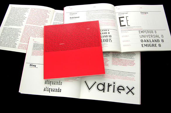
Emigre


The Emigre Exhibition catalog caught my eye wit hits interesting use of typography. A lot of the work seen on the sight is very minimal. A few words in the center of a cover. Pretty words. Pretty and clean. In the catalog they took a slightly diffferent approach. They put a paragraph's worth of information on the cover, but added attention to the title of the piece by simply changing the color of those three of four words. The white on red really stands out. There is no confusion as to what the catalog is. It gives you the nessecary information, and looks good while doing it. What more do you want?

Tuesday, February 5, 2008

Cool website.


I was in class the other day, cruising some design blogs, and I happened upon some designer dude's website that really impressed me. Everything was so clean, but still refreshing. The colors were mostly blues and whites, but it avoided the typical clinical connotation that goes along with that combination. And! It cycles through the portfolio for you. On a timer. That is displayed like its own little logo/mark. Pretty sweet.

Monday, February 4, 2008

Anatomy of a Typeface


This is Bjorn Johansson’s Anatomy of a typeface. It's a triptych that plays with the literal meaning of anatomy ~ which in typographic terms is referring to the different parts of a character. Unfortunately there is not an entire typeface in this fashion.