Monday, April 21, 2008


This is a piece byKyle Bean, student/designer/illustrator/self-proclaimed maker of things.
It is entitled the future of books.
The text on the spine is set in futura. hah.

Too bad reading on a screen blows. I guess by the time this idea would be real everyone would be getting Lasik...so straining your eyes won't matter.
I wonder if each book on cd would have a sticker you could put on the cover.. to show off what you were reading at the time. Maybe another screen on the cover. Stickers are so lo tech.

The rather difficult font game


Here is a game where you try to guess which font is displayed. I got like a 26 out of 34. The average is is 24. I want Gregg to try!

http://ajax.sayitaintslow.com/fontgame/

Monday, March 31, 2008

Persepolis playing at Plaza Theatre 7:45 nightly

Persepolis playing at Plaza Theatre 7:45 nightly!

Persepolis is the award-winning animated film based on Marjane Satrapi's autobiographical graphic novel of the same name.
Nominated for Best Animated Feature for the Acadamy Awards and winner of the Jury Prize at 2007 Cannes Film Festival.
http://www.sonypictures.com/classics/persepolis/

Tuesday, March 25, 2008

Here, Gregg.

Here is a type documentary done by BBC. It is from the 80's. It is entitled Typomania!
I'm sure this is exactly what you were looking for (snicker). I don't think the host could be any more dry. The blog where I found it called it "very interesting." I know you can't wait.

I was going the video itsself up, but blogger hates me. It's not giving me the option to do so. I actually even went to the help center to try to figure it out. Boo.

So here the address is, all un-blog savvily.

http://www.spiekermann.com/iblog/C1097932338/E1823448250/index.html

Wednesday, March 12, 2008

Chip Kidd Speaks at SCAD

SCAD-Atlanta Writer Series Presents Chip Kidd
Thursday, April 17
7:30 p.m.
SCAD-Atlanta
1600 Peachtree St., Atlanta, Ga.

Chip Kidd is known for his work in the design and literary worlds. His book jacket designs for Alfred A. Knopf (where he has worked since 1986) have helped spawn a revolution in the art of American book packaging. In 1998 he was made a member of the Alliance Graphique Internationale, and in Fall 2003 Newsweek included him in its first-ever issue devoted to design. "The Cheese Monkeys" (Scribner, 2001), Kidd’s first novel, was a national bestseller as well as a New York Times Notable Book of the Year. His second novel, "The Learners," was published February 2008. This event is free and open to the public, and a book signing will follow the lecture. Free parking available on site. For more information, call 404.253.3100

I wish our class was T/TH. Then we would not be having class.

For all of you who have had not had the pleasure of seeing Mr. Kidd speak, he is absolutely hilarious. Go.

Wednesday, February 27, 2008

What I learned in class 2/24/08

Let's see now.

I learned that it's always important to read/follow directions.
I was reaffirmed in the fact that knowing how to talk about your work is just as important, if not more so, as the work itself.
Kim is crazy.
Don't use a font that wasn't created with any punctuation.
Benjamin Franklin used Garamond.
Gregg saw Primus while we were all in middle school.

Now let's all go make typefaces out of condiments!
It looks fun!

Tuesday, February 19, 2008

Fruit and Font Fun


I just thought these were neat. The message is still very readable, even though it's hand done on a piece of fruit. I would like to see a whole bowl of these.

Wednesday, February 13, 2008

Emigre


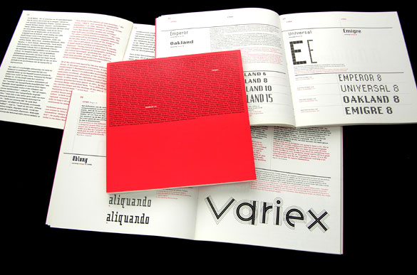
The Emigre Exhibition catalog caught my eye wit hits interesting use of typography. A lot of the work seen on the sight is very minimal. A few words in the center of a cover. Pretty words. Pretty and clean. In the catalog they took a slightly diffferent approach. They put a paragraph's worth of information on the cover, but added attention to the title of the piece by simply changing the color of those three of four words. The white on red really stands out. There is no confusion as to what the catalog is. It gives you the nessecary information, and looks good while doing it. What more do you want?

Tuesday, February 5, 2008

Cool website.


I was in class the other day, cruising some design blogs, and I happened upon some designer dude's website that really impressed me. Everything was so clean, but still refreshing. The colors were mostly blues and whites, but it avoided the typical clinical connotation that goes along with that combination. And! It cycles through the portfolio for you. On a timer. That is displayed like its own little logo/mark. Pretty sweet.

Monday, February 4, 2008

Anatomy of a Typeface


This is Bjorn Johansson’s Anatomy of a typeface. It's a triptych that plays with the literal meaning of anatomy ~ which in typographic terms is referring to the different parts of a character. Unfortunately there is not an entire typeface in this fashion.

Wednesday, January 30, 2008

Website Typography

Good? Bad? I'm the judge!

Good news first.
A high end jean company with a generally bangin' website.
There is some every exciting hand done type mixed in with pretty script. The big blocks of text are put away into little packages to keep the main page as clutter free as you wanna be. Some text blocks are in all caps, making it a bit hard to read, but it's not a great deal of information so I'll let it go.
The multi-layer drag and drop interface is quite fun.
http://www.prpsgoods.com/


and the bad news is...
http://www.ronpaul.org/
General organization is poor. The line lengths are too long. The underlining of the headings looks sophomoric. There is too much white space left on the right side. about & links are a different color than home & contact for no apparent reason. yeah.

Wednesday, January 23, 2008

Road Sign Font Change!

http://www.nytimes.com/2007/08/12/magazine/12fonts-t.html?pagewanted=1&_r=1&sq=street%20sign%20font&st=nyt&scp=1

Signs all over the US are changing from Highway Gothic to Clearview. This new font was created by Don Meeker, an environmental graphic designer, who "realized issues of readability were becoming increasingly important, especially at night, when the shine of bright headlights on highly reflective material can turn text into a glowing, blurry mess."
So some people got together to change it.

“I’ve always thought that design can be a form of social activism.” - Don Meeker

Check out the slide show.

Tuesday, January 22, 2008

Saarinen@ MODA Thursday Jan 31st

You are invited to the Public Opening Reception of The Furniture of Eero Saarinen: Designs for Everyday Living at the Museum of Design Atlanta.

January 31st, 5 pm - 8 pm
This exhibition features the furniture designs of Eero Saarinen, who was one of the foremost prominent architects in the 1950’s. Designs for Everyday Living presents examples of Saarinen’s early furniture designs, sketches, photographs and descriptions of each of Saarinen’s furniture designs and collections. Knoll International has provided archival examples and pieces of Saarinen’s timeless designs from current production.

Colorstrology

Color is a reflection of the suns light and all its glory.
There is a personal color that corresponds to the real you.
Imagine a color that could compliment your innermost nature.

www.colorstrology.com

Sponsored by Pantone INC.

Wednesday, January 16, 2008

Good Typography/Bad Typography


This is my example of good typography. Pictured above is an image of the book Fingerprint, by Chen Design Associates. I purchased this book a few months ago and it r0xx0rs. Anyway, the book is about handmade type that is both successful and visually !exciting! The type on the cover is good because:

A) It relates to the subject matter of the book (because it's hand done)
B) Reads easy
C) The space between letters is consistent
D) The rotated INs are clever and visually interesting
E) Hand done type that is done well looks cool


This is my example of bad typography. The letterhead for the estate agent/listing company, while the banner at the top is cheesy, generally gives off a serious/ corporate..trust us.. kind of feel. "STUARTS" is very strong in a nice sans serif, while "Estate Agents and Residential Lettings" tells you they are classic and conservative with a typeface that looks like Garamond.. or something like that.
THEN!
Comic sans!!
Noooooooooooooo!!!
The name of the font has the word comic in it! No one will ever take you seriously!
Especially when you're dealing with investments!
It does not speak to the target audience. The font choice is entirely innapropriate..not to mention tacky...

Monday, January 14, 2008

Typography vidyo

Here is a video that might be a fun way to review the basics we touched on last week.
Glyphs, ascenders, descenders.. and more fun things are explained in a visually interesting context.
I thought it might be a nice break from pdfs.
Enjoy!

Sunday, January 13, 2008

oh, Barbarella.

This is an opening sequence from the 1968 film starring Jane Fonda.
As she removes her spacesuit, letters escape..bounce around.. then come together to form actors names, etc.
This is a really innovative approach to using typography in the title sequence scenario.
Love it!

* Brief nudity

Wednesday, January 9, 2008

Even the government in Switzerland has good taste


I recently aquired a new US passport. It was more tacky and terrible than I ever could have imagined.
Not that I really expected much, but it made me wonder...
Is there an attractive passport out there?
Yes, yes, and yes.
Thank you Switzerland .
of course the currency is wonderful as well.

I'm always excited when things that don't have to be pretty or well thought out, are.

* The subtle embossing on the front is really unexpected. and awesome.